
Design Showroom: Cloé Berthon
Cloé Berthon — RAEIRO, chromatic traverse
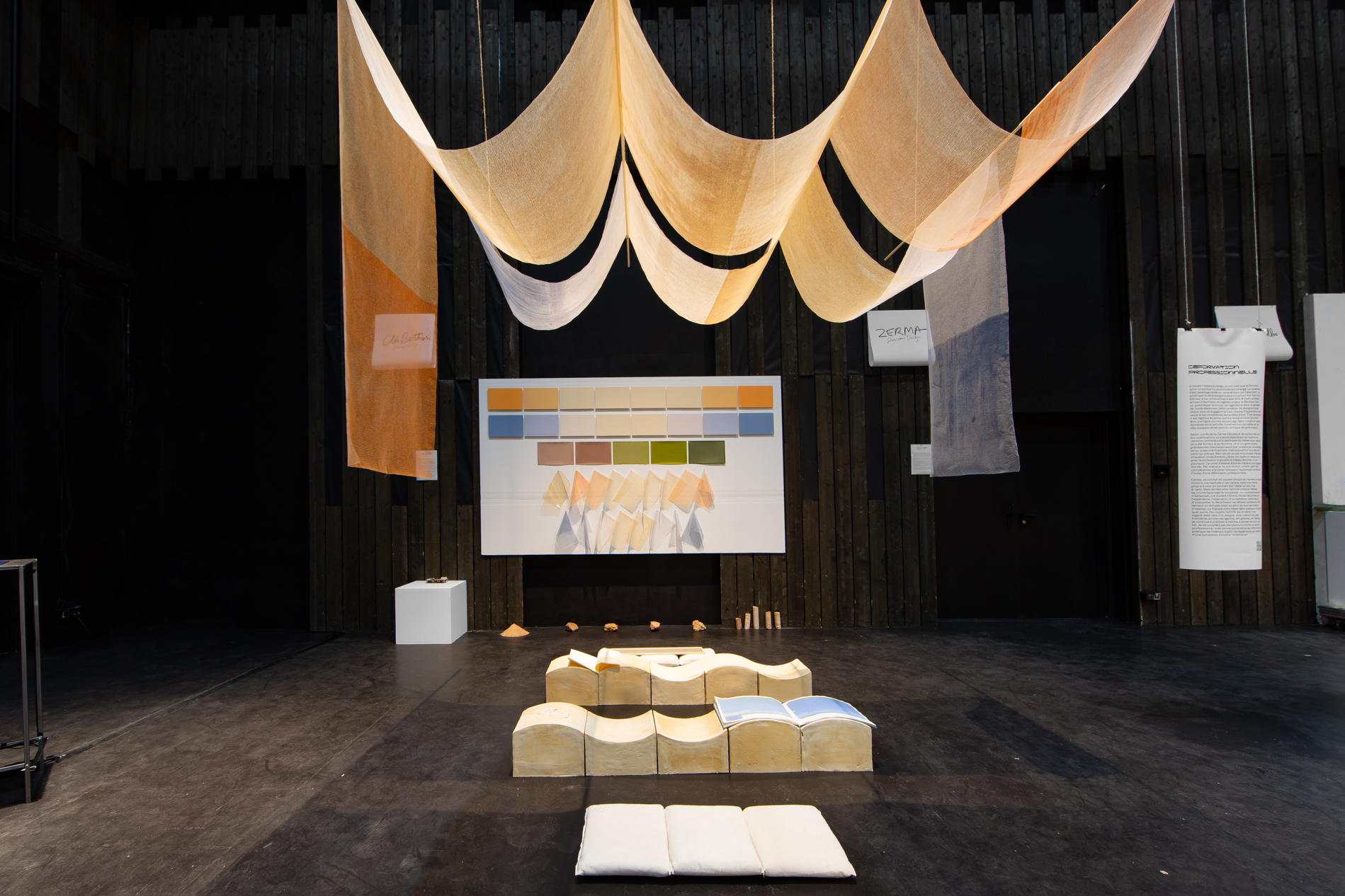
Cloé Berthon’s work navigates between light, color, and language. With RAEIRO, a graphic design project that takes the form of an installation deployed in space, she creates a delicate work where color becomes memory, typography becomes a filter, and the installation becomes a sensitive threshold between two geographies: Paris and Marseille.
Starting from a sense of loss—that of the south, of the warm light that envelops the stones and passes through the eyelids—RAEIRO attempts to bring the poles closer together. Cloé Berthon captures light not as a physical phenomenon, but as an emotional one: what light provokes, what it reveals about us, what it retains in its color. The process begins with the chromatic capture of the luminosity of the two places, every day at noon, the blue, cold, and harsh light of Paris, and the orange, warm, and overwhelming light of Marseille. From this capture emerges the language, the translation, the color chart that describes what the eye observes in one place and then in the other. This color chart will be the chromatic reference for Cloé Berthon’s research.
A volume of monotypes reveals a journey: that of a train crossing between Paris and Marseille, as seen from the window. The landscape becomes a gentle abstraction distorted by speed, a digital glitch, a focusing error. The colors of the north and the colors of the south slide and intersect across the pages, as one slides from one station to another. What we see is no longer reality, but its retinal persistence, its inner imprint.
Words, meanwhile, are printed on a page, read in suspension, infusing the air with an almost immaterial white pigment. Typography acts as a veil, light is filtered, and the shadow of words tells a story. Printed in silkscreen on tracing paper, these typographic grays become areas of narrative transparency where the text can be read and traversed. It is also through white that Cloé Berthon suggests her past presence in these places, through the evanescent traces of an absent body left here under the blazing sun.
The ink itself is a memory of the territory. In her holistic approach, Cloé Berthon seeks out the pigmentary origins of the landscape. She produces screen printing ink from Vitrolles stone, pink marble, crushed and ground into pigment, evoking both the dust of Mediterranean trails and the low light of late afternoons. Paradoxically, it is in Parisian sandstone that ceramics extend the chromatic materiality of the landscape.
The entire installation evokes Provençal landscapes, rolling hills, and laundry hanging to dry in windows, while also recreating a printing or bookbinding workshop where each page of the book being produced hangs waiting to be assembled into a volume. Everything is connected: narrative, typography, color, material, light.
RAEIRO is a work of the in-between: between cities, between nuances, between languages. Cloé Berthon articulates a concept of graphic design that, beyond organizing signs and their interpretation, explores their ability to embody a sensitive memory and compose an atmosphere. It is a design that touches on the perceptive and the poetic.
Text by Camille Lamy